iOS 26 Camera App Breakdown: Apple just dropped something big with iOS 26, and the camera app has gotten a complete makeover that’s going to change how you capture your everyday moments. If you’ve been using your iPhone camera for a while, you might feel a bit confused when you first open the app after updating. Don’t worry – that’s completely normal, and once you understand what’s changed, you’ll actually find it much easier to use.
The Biggest Change: Welcome to Liquid Glass Design
The first thing you’ll notice is how different everything looks. Apple has introduced what they call “Liquid Glass” design throughout iOS 26, and the camera app showcases this beautifully. Think of it like looking through actual glass – everything has this translucent, flowing quality that makes the interface feel more alive and less cluttered.
When you open the camera app now, you’ll see that menus and buttons seem to “float” over your camera preview, allowing you to see more of what you’re actually trying to photograph. The old black bars and harsh edges are gone, replaced by these smooth, rounded elements that blend seamlessly with your content.
Simplified Interface That Actually Makes Sense
Here’s where things get really practical. Apple listened to everyone who complained about the camera app becoming too complicated over the years. Remember how you used to accidentally switch to panorama mode when you just wanted to take a quick photo? That frustration is now history.
The new interface presents you with just two main options right away: Photo and Video. These appear below the shutter button now, instead of above it like before. This simple change makes a huge difference because your finger naturally falls to this area when holding your phone.
But don’t panic thinking Apple removed all your favorite modes. Portrait, Cinematic, Slow-Mo, and everything else is still there. You just swipe left or right on the mode selector to access them, exactly like before. The difference is they’re not cluttering up your main screen anymore, so you’re less likely to tap them by accident.
The Magic of Pop-Up Menus
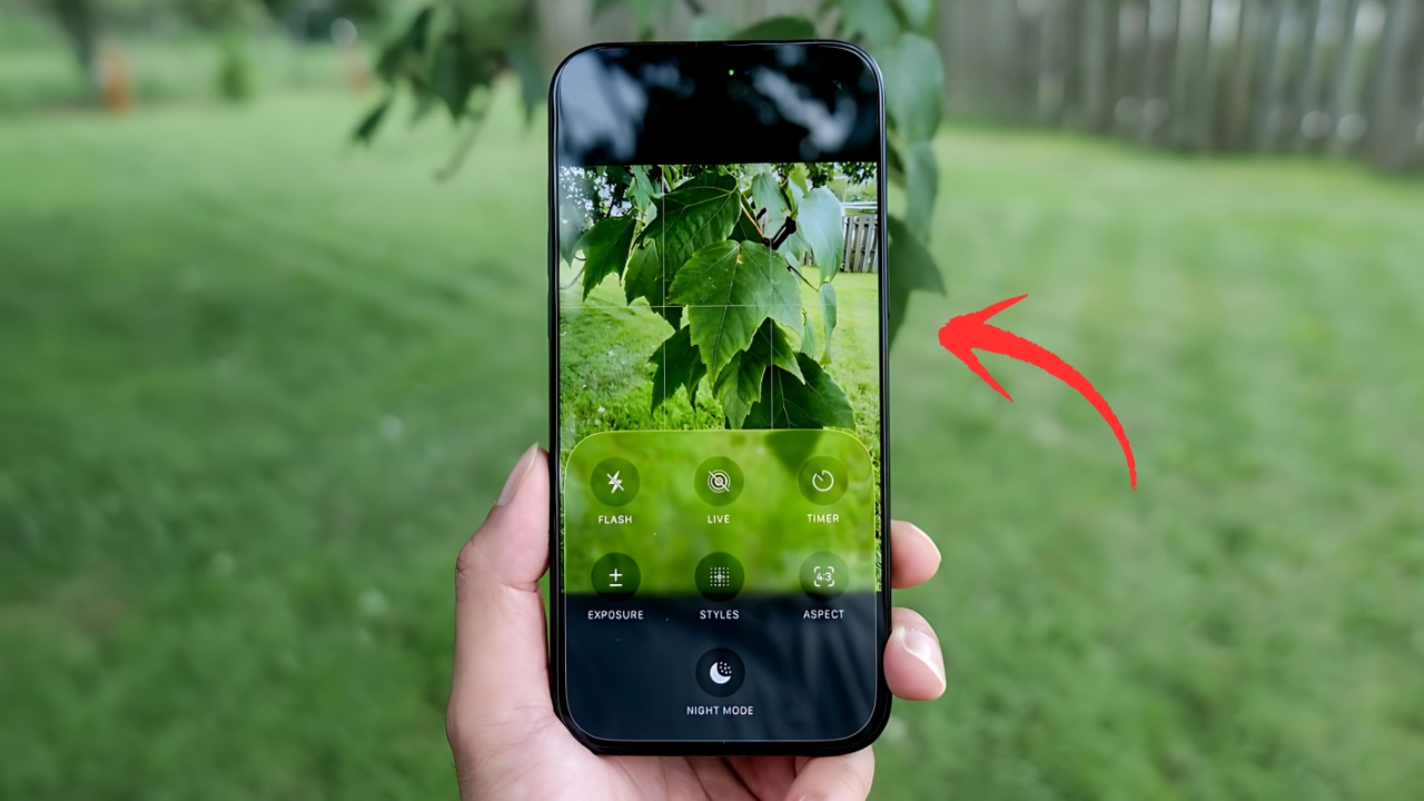
One of the smartest changes Apple made is how they handle all those camera settings. Instead of having tiny buttons scattered around the screen, many controls now live in elegant pop-up menus that appear when you need them.
When you tap on “Photo” (or whichever mode you’re using), a beautiful translucent menu slides up from the bottom. This menu gives you large, easy-to-tap buttons for everything you need: Flash settings, Live Photo controls, Timer, Exposure adjustments, Photographic Styles, Aspect ratio options, and Night Mode.
This approach solves a real problem many people faced – those tiny buttons were hard to see and even harder to tap accurately, especially in bright sunlight or when you’re trying to capture something quickly.
Settings That Finally Live Where They Should
Apple made a change that photography enthusiasts have been requesting for years. Many camera settings that used to require a trip to the Settings app are now accessible directly in the camera interface.
Look at the upper-left corner of your screen when taking photos or videos. You’ll see information about your current capture settings – things like whether you’re shooting in HEIC or RAW format, what resolution you’re using, or what frame rate you’ve selected for video. Tap on this area, and you can change these settings right there without leaving the camera app.
This is genuinely helpful for anyone who likes to adjust their camera settings based on what they’re shooting. Taking photos of your kids playing outside? You might want a higher frame rate for video. Capturing a sunset for your photo album? Maybe you want to switch to RAW format for better editing flexibility later.
Smart Features That Work Behind the Scenes
iOS 26 introduces some clever new features that help you take better photos without thinking about it. Lens Cleaning Hints is particularly useful – your phone will actually suggest when your camera lens might be dirty and affecting your photo quality. You can enable this in Settings > Camera if you want your iPhone to be your photography assistant.
The camera app also gained better integration with your AirPods. If you have AirPods Pro 2 or AirPods 4, you can use them as a remote shutter. This feature is perfect for group photos, selfies, or any situation where you want to step away from your phone to take the shot. Enable Camera Remote in your AirPods settings, and you can trigger the shutter with a press of your AirPods stem.
Visual Improvements That Matter
The new design isn’t just about looking pretty – it actually improves your photography experience. The area behind the camera controls is now more transparent, so you can see more of what’s outside your main shot. This helps with composition because you can better judge how to frame your subject.
The shutter button itself has been refined with a more subtle design that fits the overall Liquid Glass aesthetic. Focus indicators and other on-screen elements now have this same flowing, glass-like quality that makes them easier to see against various backgrounds.
Navigation Changes That Make Sense
Apple moved some elements around, but in logical ways. The button to view your last photo (now round instead of square) and the camera flip button stay in their familiar positions. However, you’ll notice that some controls that used to live at the top of the screen are now tucked into those new pop-up menus we discussed.
This might take a day or two to get used to, but most people find it more intuitive once they understand the system. Everything is still there – it’s just organized in a way that puts the most important stuff (taking the actual photo) front and center.
Getting the Most Out of Your Updated Camera
To really take advantage of these changes, spend a few minutes exploring those pop-up menus. Tap on your current mode to see what options are available, and don’t be afraid to experiment with the settings that are now more accessible.
If you’re someone who frequently switches between different camera settings, you’ll love having quick access to resolution and quality controls without diving into the Settings app. And if you mostly just point and shoot, you’ll appreciate how much cleaner and less overwhelming the interface feels now.
The key is understanding that Apple designed this update to accommodate both casual photographers and more serious enthusiasts. The simple interface keeps things approachable for everyone, while the expandable menus provide depth for those who want more control.
iOS 26 represents Apple’s biggest camera app update in years, and while change can feel uncomfortable at first, these improvements genuinely make the camera more enjoyable and effective to use. The combination of cleaner design, smarter organization, and more accessible settings creates an experience that helps you focus on what really matters – capturing the moments that matter to you.